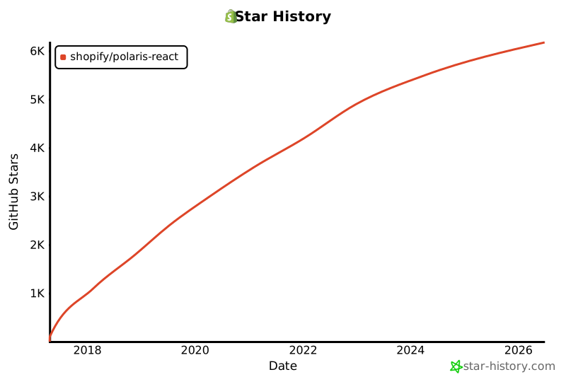
Polaris React is a production-ready component library that implements Shopify's Polaris design system for building consistent merchant-facing admin interfaces. It provides a comprehensive set of reusable React components, including accessible form inputs, data display elements, layout and navigation structures, and visual feedback indicators, all styled through a semantic color token system applied via CSS custom properties for dynamic light and dark mode support.
Principalele funcționalități ale shopify/polaris-react sunt: React Component Libraries, Admin Interface Components, Icon Sets, Commerce, Icon Renderers, Icons, Navigation and Layouts, Commerce Icon Libraries.
Alternativele open-source pentru shopify/polaris-react includ: cosscom/coss — Coss is an accessible UI component library and design system framework used to build web interfaces. It provides a… creativetimofficial/material-tailwind — Material Tailwind is a responsive web UI framework and component library built with Tailwind CSS. It provides a… mui/base-ui — Base UI is a headless component library and unstyled framework providing accessible interface primitives. It decouples… coreui/coreui-free-bootstrap-admin-template — CoreUI Free Bootstrap Admin Template is a pre-built, responsive admin dashboard template built on Bootstrap 5 for… hunvreus/basecoat — Basecoat is a zero-runtime UI library and themable interface framework consisting of a set of accessible web… chakra-ui/zag — Zag is a headless UI state machine library that provides unstyled component logic to ensure consistent behavior across…

Coss is an accessible UI component library and design system framework used to build web interfaces. It provides a comprehensive kit of interactive elements and layout building blocks that follow screen reader and keyboard navigation standards. The project functions as a UI overlay management library, offering specialized tools for implementing anchored popovers, tooltips, and slide-out panels with smooth transitions. It includes a set of accessible form primitives and selection controls to ensure compatibility across different assistive technologies. Its broader capabilities cover the const

Material Tailwind is a responsive web UI framework and component library built with Tailwind CSS. It provides a customizable design system that implements Material Design principles for web applications. The project focuses on a customizable design system, allowing for centralized theme configuration and utility-based styling to maintain visual consistency across interfaces. The library includes a wide range of reusable interface elements, covering layout structures, navigation systems, and overlay components. It provides specialized tools for web form construction, data input controls, and

Base UI is a headless component library and unstyled framework providing accessible interface primitives. It decouples behavioral logic and state management from the visual layer, allowing developers to implement complex UI patterns while maintaining total control over the final styling. The library implements WAI-ARIA design patterns to ensure all primitives support standard keyboard navigation and screen reader accessibility. It provides a suite of low-level building blocks that handle the internal mechanics of interface elements without bundling any CSS. The framework covers a broad range

CoreUI Free Bootstrap Admin Template is a pre-built, responsive admin dashboard template built on Bootstrap 5 for constructing back-office interfaces. It provides a library of UI components with native wrappers for React, Vue, and Angular applications, alongside a Sass-based theming system for managing brand colors, dark mode, and design tokens via variables and CSS custom properties. The template includes a set of advanced form controls such as autocomplete, date pickers, and multi-step wizards with built-in validation, and supports switching the entire interface between built-in dark and li
